
Building the Foundation
Supporting Change
Effectively transitioning any complex change in an organization requires strong support from leadership and ongoing, clear and repeated communication that answers the questions: Why? What does this mean for me and my role? What are the new expectations?
For data quality and reporting specifically, there are several answers that you can share with those involved in the data and reporting role within your practice:
- Collecting high-quality data is essential for quality improvement, population health management and value-based care.
- Measuring performance will allow everyone within the practice to monitor and identify opportunities to improve patient care.
- Consistently tracking and reporting on a standard set of quality measures, especially disaggregated by race and ethnicity, will reveal the current state of a patient population, identify disparities in care and outcomes, and allow for monitoring of improvements over time.
As you work your way through this guide, and are thinking about the changes that will be required of your staff, map out what it specifically means for different people’s roles and responsibilities and the expectations for how and when those changes are made. Be sure to communicate this early and regularly, and engage leaders who can be ambassadors and reinforce a very consistent message.
In addition to ongoing, clear and repeated communication, having the sponsorship of a senior leader is absolutely crucial for the success of data governance projects and ensuring effective change.[1] A senior leader can help in the following ways:
- Bring credibility to the changes around data quality and reporting.
- Overcome the obstacle of organizational silos and encourage collaboration to meet data and reporting requirements.
- Serve as an advocate and problem solver by addressing potential roadblocks and ensuring data governance efforts remain on track.
- Demonstrate and communicate the value and impact of data governance initiatives to other senior leaders and staff.
- Secure ongoing resources, support and commitment at the highest levels of the organization.
Using Storytelling to Develop Support for Changes
Practices should consider developing a case for supporting changes by showing their data in story format. This allows for crucial data points to be emphasized while also showing real-world applications and why a particular change is impactful. Some benefits include:
- Improved data quality, care and sustainability leads to an ability to spot outcomes and issues in a visual manner.
- Enhanced collaboration and communication leads to aligned efforts and understanding.
- Informed decision making leads to quickly identifying key insights and opportunities within a practice.
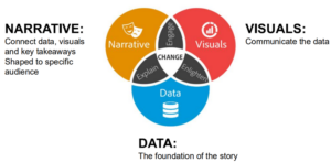
- Practices should consider visuals, data and a narrative as key elements when building their data story.
FIGURE 1: THREE ELEMENTS OF EVERY DATA STORY
The following steps should be utilized for generating effective data stories. These steps are discussed in greater detail in the PHMI webinar Data That Delivers: Data Visualization for Impact, Action, and Sustainability.
1. Determine your audience’s needs and questions.
By understanding the audience, the message can be tailored, therefore making it more impactful. Figure 2 provides example roles, what why a visualization may be required, and examples of visualizations that may be utilized.
FIGURE 2: AUDIENCE NEEDS IN DATA STORYTELLING
Organization Role |
Use of Visualization |
Example Visualization |
Board |
Decision making |
KPIs |
Leadership |
Decision making / reimbursement / resource allocation, grant writing, etc. |
P4P, empanelment/attribution, quality measures |
Providers |
Quality care, population health, efficiency |
Quality measures by panel, empanelment, operational, care gaps |
Care Managers |
Patient care, utilization of CM role |
Quality measures by CM panel, graduated patients |
Outreach & Care Coordinators |
Patient access, continuity of care |
No shows, upcoming appointments, ADT |
MAs & Nursing Staff |
Patient care, efficiency, missed opportunities |
Relevant quality measures, care gaps closed |
Community Health Workers |
Continuity of coverage, barriers to care |
Insurance chum, SDOH |
Patient Engagement |
Self-management |
Lab/vitals values over time, goals, etc. |
2. Assess your HIT environment to identify best tools for the job.
Determine what platform will allow for data to be obtained, and displayed in a manner that will have the most impact. Each platform has their benefits and challenges. See Figure 3 for an analysis of potential platforms.
FIGURE 3: ANALYSIS OF HIT DATA ANALYSIS PLATFORMS
Platform |
Benefits |
Challenges |
Electronic Health Record |
Lots of data |
More limited in reporting/analysis |
Population Health Management Analysis Overlay/Tool (Innovaccer, DRVS, etc.) |
Population level reporting |
Varying methods of analysis |
Power BI |
Interactive in-depth analysis |
|
Excel |
Great for gap reporting and closing gaps. |
Great for simple analysis |
3. Ensure accurate data.
Data should be validated and regularly evaluated to ensure accuracy.
4. Choose visuals that clearly highlight what needs to be communicated.
Select the method of display that best fits the needs of your practice. Figure 4 describes the type of visualization and potential uses. Yale University also provides additional guidance on developing data visualizations. This article discusses a decision tree to determine which type of data visualization should be utilized.
FIGURE 4: TYPES OF VISUALIZATIONS
Chart |
Display |
Bar or column chart |
Show trends in categories of data. |
Pie or donut chart |
Shows proportions. |
Scatter plot |
Understand relationship between variables. |
Line or area chart |
Visualize trends among continuous data. |
Tables |
Display scorecards, multiple variables or other details. |
5. Develop your narrative.
Use this format to explain what happened.
- The problem: What are you trying to solve?
- The solution: What did you have to do to solve the problem?
- The outcome: What happened as a result.